GO-BOX
Project Overview
GO-JEK is a startup based in Jakarta, Indonesia which emerges from an app-based motorcycle taxi service (also known as “Ojek” in Indonesian) and later branched into several services such as e-wallet, food delivery, car rides, and even personal massage. GO-BOX is one of GO-JEK’s services that specializes in transporting items.
Goals
User Research: Learn more about the user’s experience of different user groups with the application regarding their spatial ability, frequency of usage, and use cases.
Design: Increase the accessibility, usability, and overall user experience of the application.
Problems
Current UI
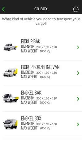
The current vehicle selection UI
User Journey
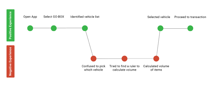
“Which vehicle should I use?” my mom asked. She thought the vehicles looked very similar and the dimensions didn’t help her much in estimating how her items will fit within the dimensions of the vehicle. She forgot where the last time she put the tape measure. After she calculated the volume and finally selected a vehicle, she mentioned that it took her a long time to estimate the volume properly.
Background Research
Survey
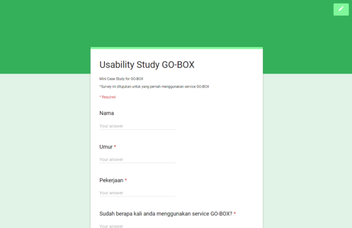
I created a survey to learn some insights from recent customers of GO-BOX. Since I am a student who is currently studying abroad in the US, I created a Google Forms survey to be distributed in Indonesia.
- “How many times have you used GO-BOX before?"
- “What’s the main reason behind the last time you used GO-BOX?”
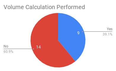
- “The last time you used GO-BOX, did you calculate the volume of your items before you used the service?”
- “If you calculated the volume of your items, what was your method? If you didn’t, what was the reason behind it?”
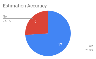
- “Was your estimation correct?”
- “Are you familiar with the term Augmented Reality? From a scale from 1 to 5, how much are you interested to use an Augmented Reality feature?”
- Any comments or questions?"
Survey Results
I got 23 respondents & I compiled the data into one spreadsheet.
Based on the survey results, I found out that:
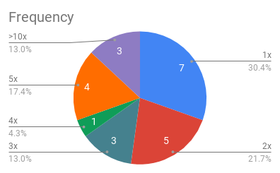
- Most users are first-time users, some of them have used the app multiple times
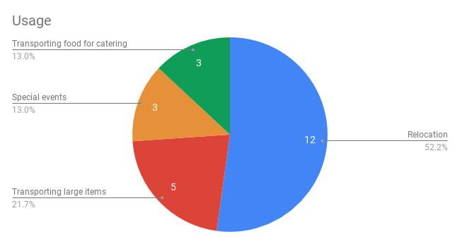
- Most users use the service for relocation, followed by transporting large items, & special events
- Most users don't calculate the volume of items transported
- Most users got their estimation correct, but there are some users that didn't estimate correctly
Read survey results in appendix
Familiarity with Augmented Reality
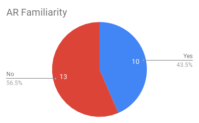
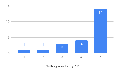
It wasn’t a surprise that a lot of respondents in Indonesia have never heard of Augmented Reality before, especially the older generations. But, what surprised me is their willingness to try something new.
This has also proven that the Indonesian market has a high adoption rate, meaning that people would love to try new things even they aren’t really familiar with them.
Personas
Based on the survey results, I created three Personas of each user group to categorize their needs and uses which can be categorized into three main groups:
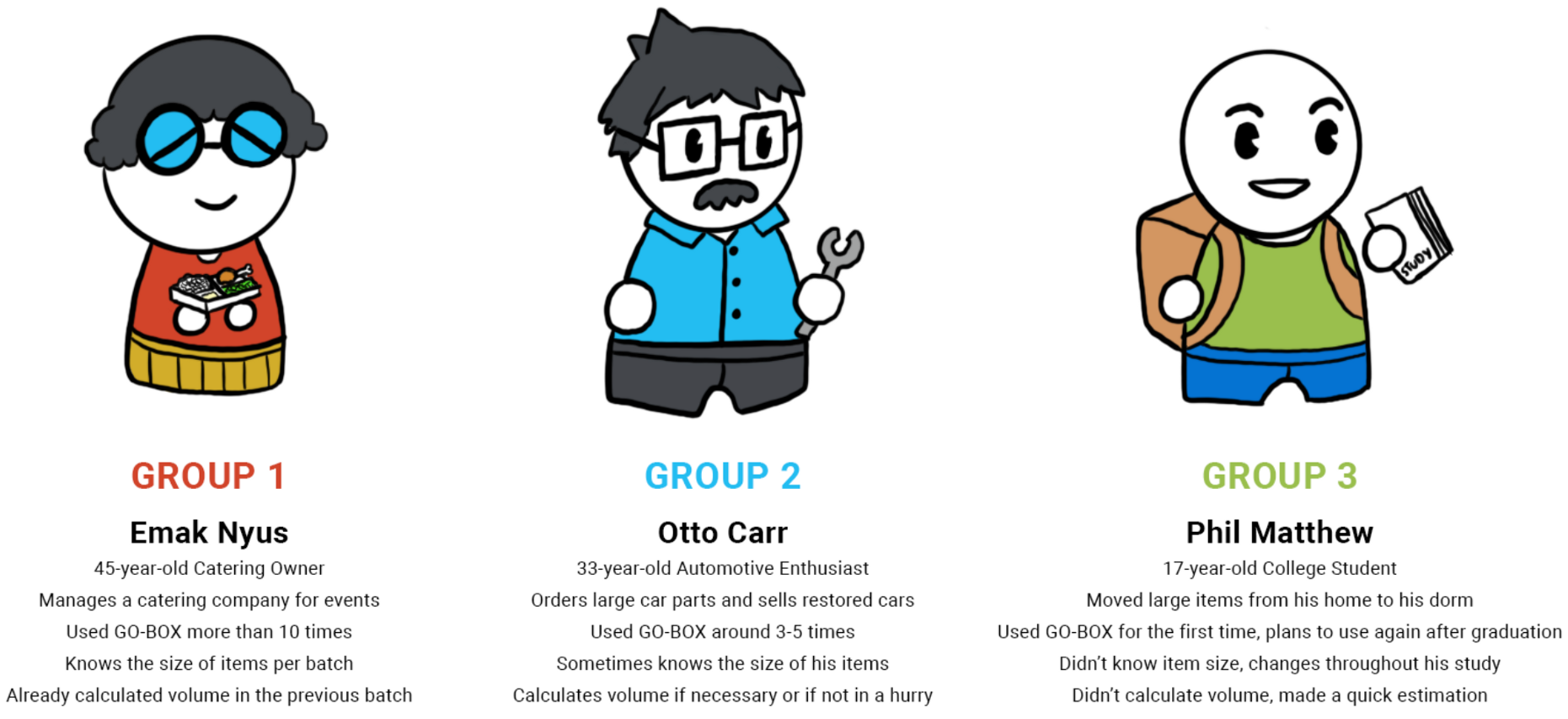
By identifying these user groups, I can see which user group needs a redesign of the application, sorted by their urgency from the most to the least: Group 3: Need the feature the most. Group 2: Might need the feature in some occasions. Group 1: Already satisfied with the application, there is no need to use the new feature.
Design
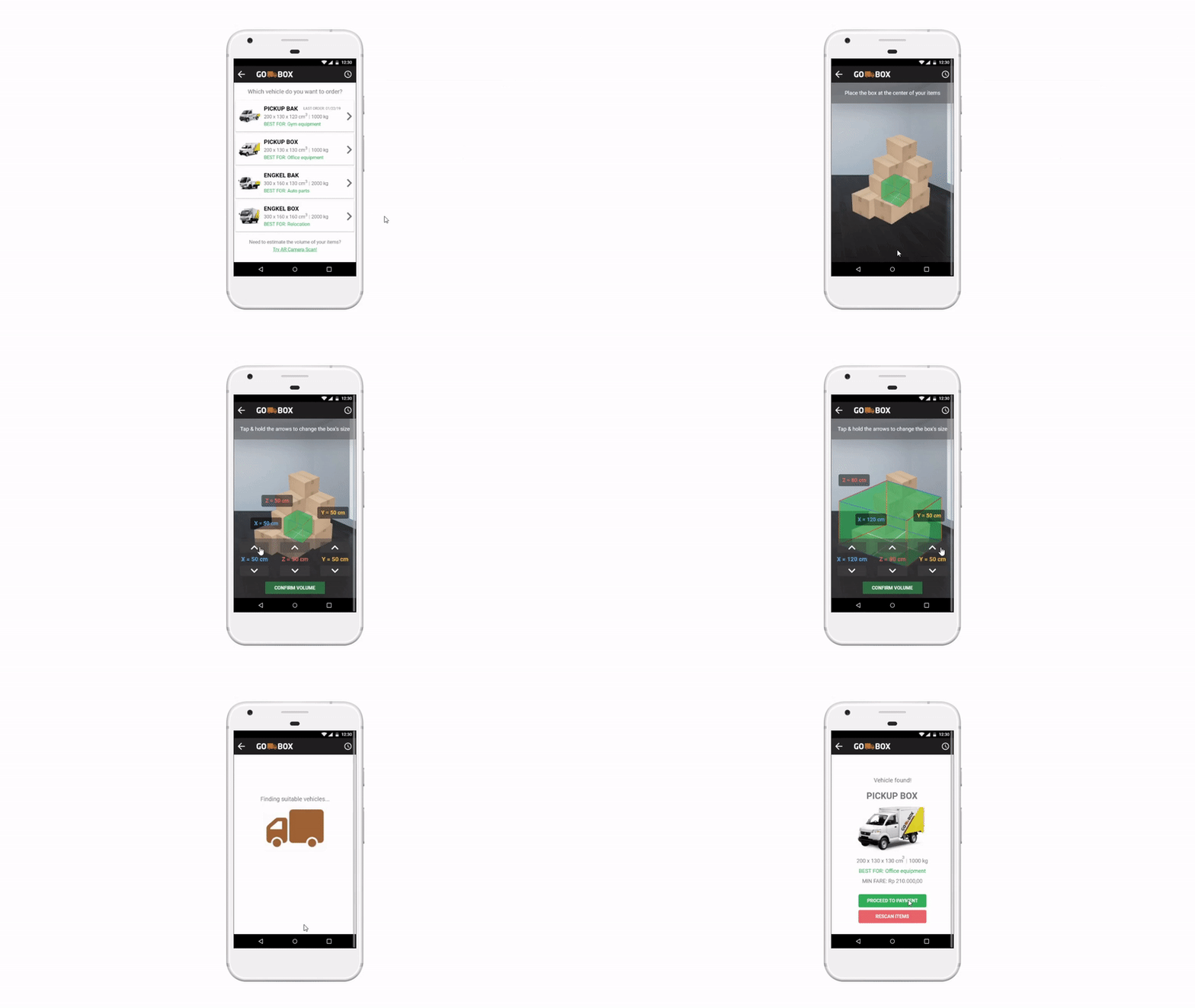
Augmented Reality Measuring Tool
It is important to keep the user interface design accessible & usable for all identified user groups to fulfill the user goals that the app has promised.
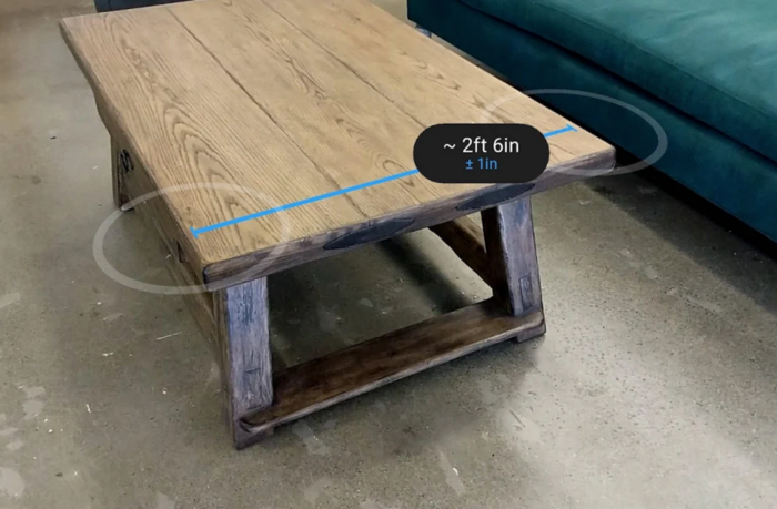
- My design is inspired by Google’s ARCore-based Measure app & Apple’s ARKit-based Measure app.
- Users can select a starting point and an ending point which shows the length of an object as simple as using a ruler.
- Users can calculate the volume of their items by estimating the length, width, and height of the items.
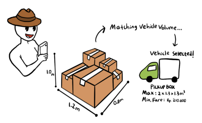
- The system matches the available vehicle by matching their volume that automatically selects the vehicle.
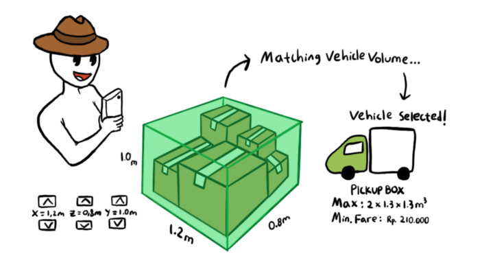
Users can put a scalable box on augmented reality. Simply place a box at the center of the items, then modify the length of each axis by tapping and holding the arrow buttons or entering a value to the user’s needs.
Pointers
I put suggestions which are popular among users to help illustrate what users usually order. I also put a space where a text will show on the last time a user ordered a specific vehicle. This is helpful for users to get a better picture of the vehicle’s size if they want to order another vehicle where they can estimate smaller or bigger vehicle based on their last order.
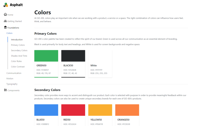
Design Language System
Prototype
Low Fidelity Prototype
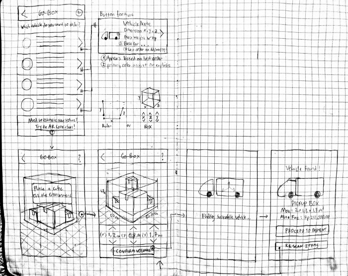
I started from drawing hand-drawn sketches of wireframes.
High Fidelity Prototype
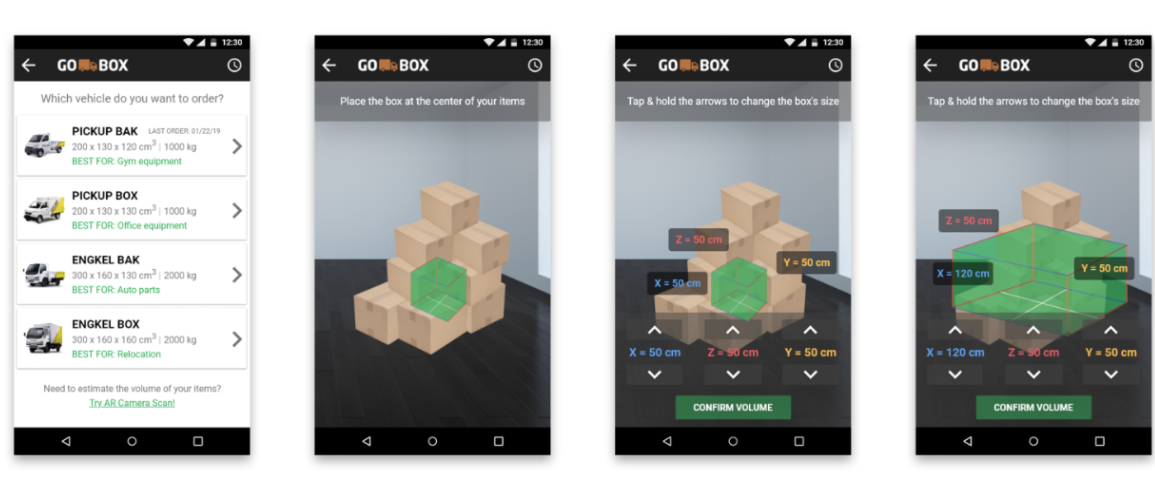
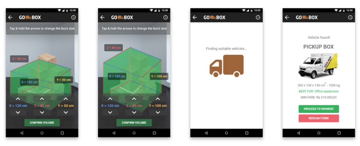
I used Sketch for designing the prototype. I used Marvel for creating the interactive prototype and generating a URL to be distributed for gaining feedback. The prototype link can be accessed here.
Conclusion
Second Survey
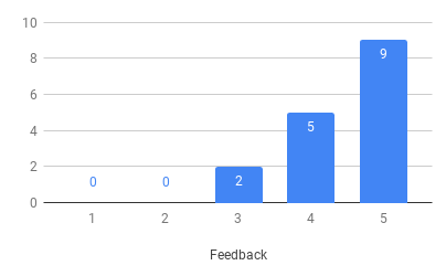
I reached out to the previous survey takers, which 16 out of 23 responded back.
I asked them to rate “How much they would want to use my design on a scale from 1 to 5 (5 being the most)” and provide comments regarding my design. I received great feedback from the respondents.
Revised User Journey
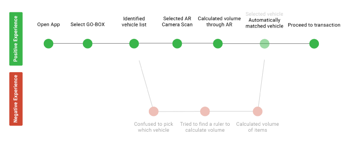
It was a shame that I couldn’t perform a think-aloud usability test to all the respondents due to my absence in Indonesia. I asked my mom for a video call and performed a usability test with my design and she found it a lot easier to use.
Study Takeaways
I’ve learned there are multiple user groups with different needs and I tested my design that can potentially increase the accessibility, usability, and overall user experience of the application.
This might be a small experimental project, as well as the technical and time constraints, but it shows a lot of potential what augmented reality could be beneficial in our lives.
Read More
Appendix
Survey Results
Frequency
Usage
Volume Calculation
